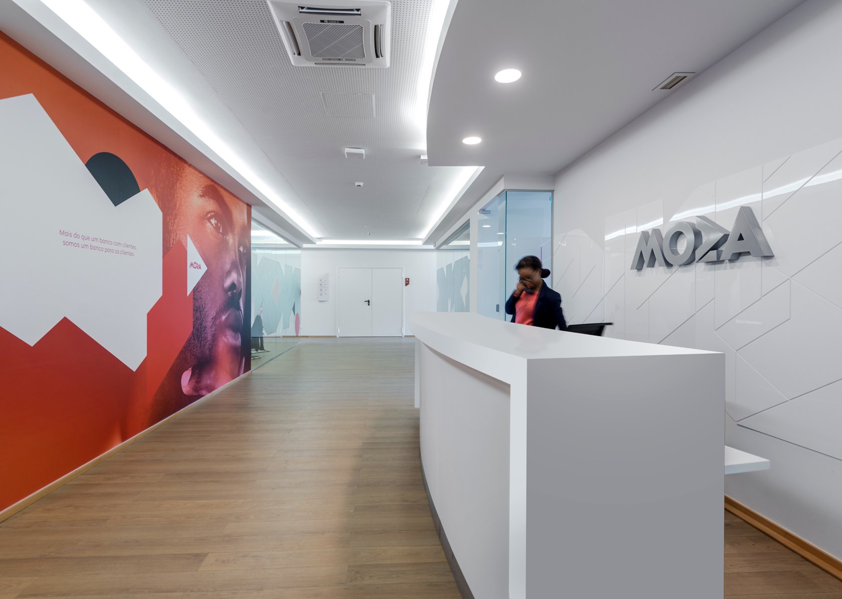
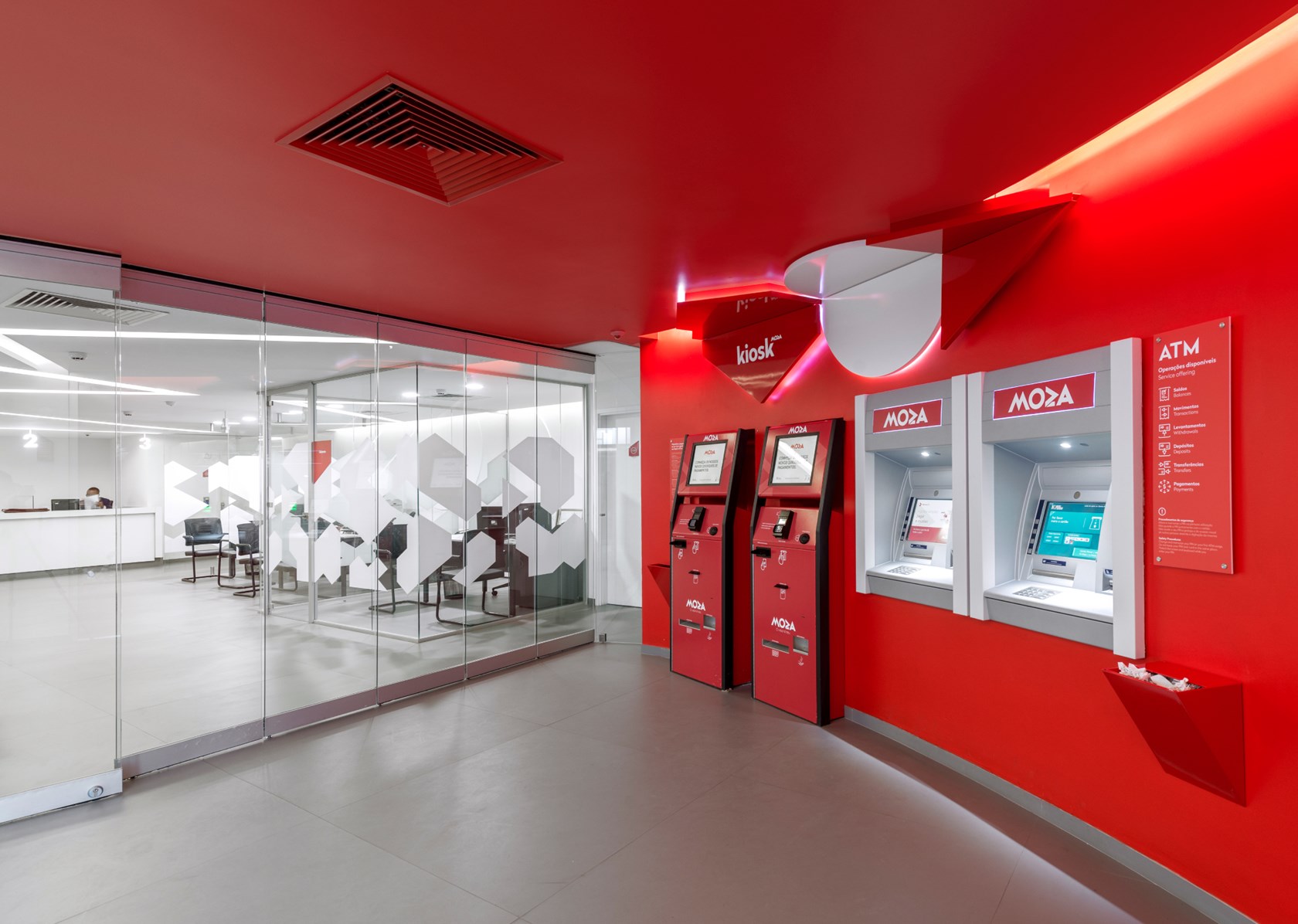
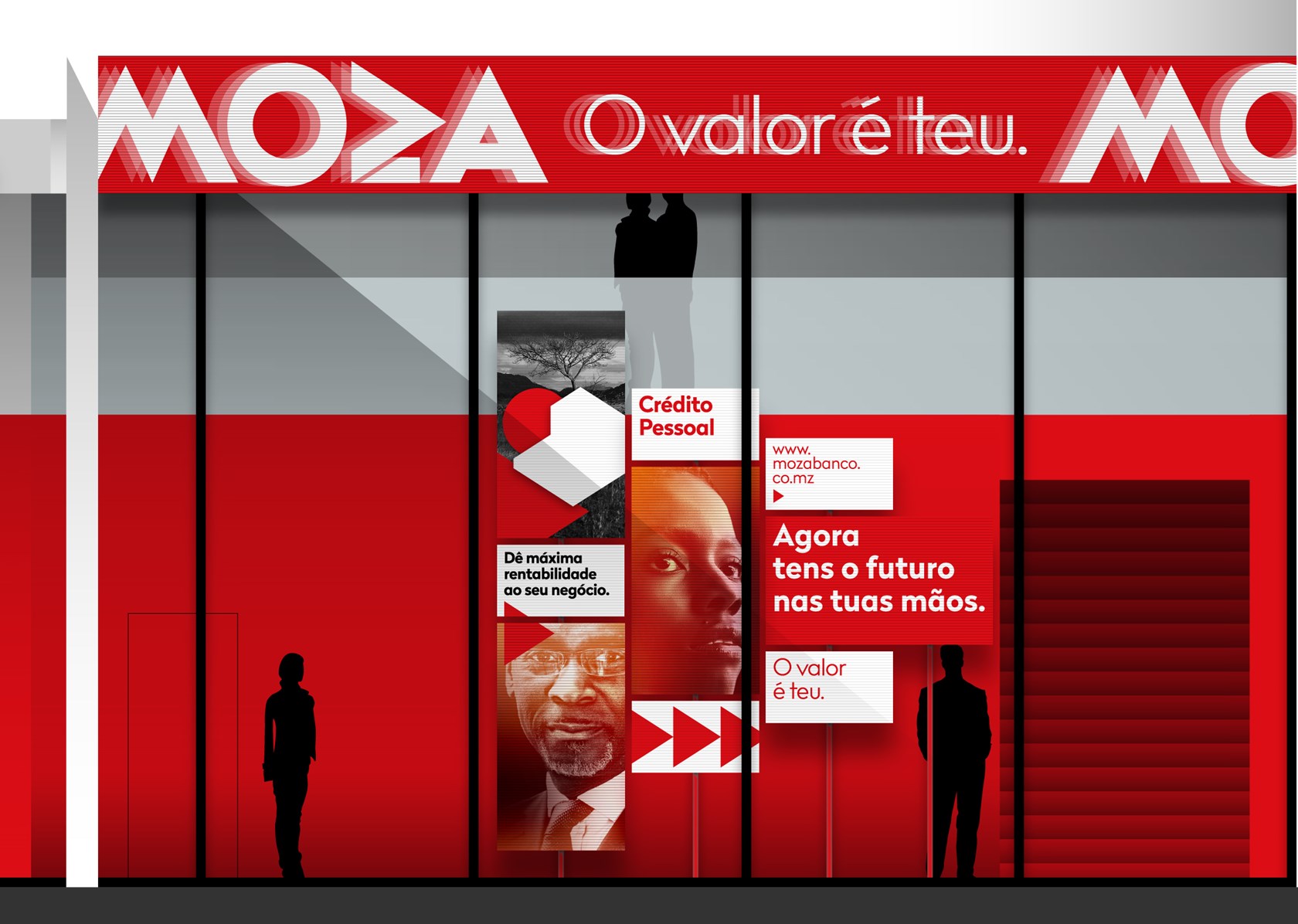
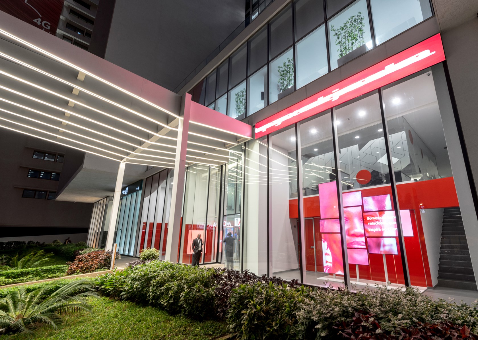
Following an exhaustive survey, a visual and verbal concept was created based on the idea that Moza was a bank that invested heavily in the relationship with all the stakeholders, clients in particular.
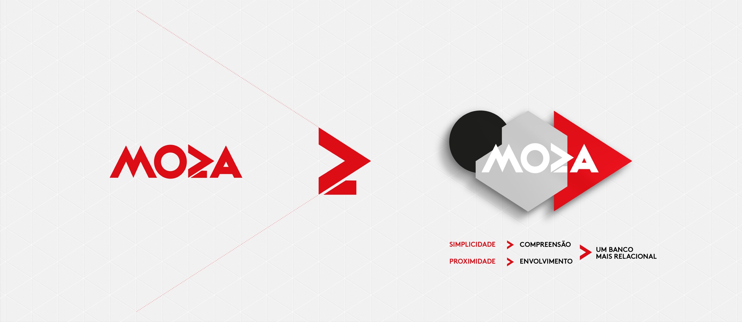
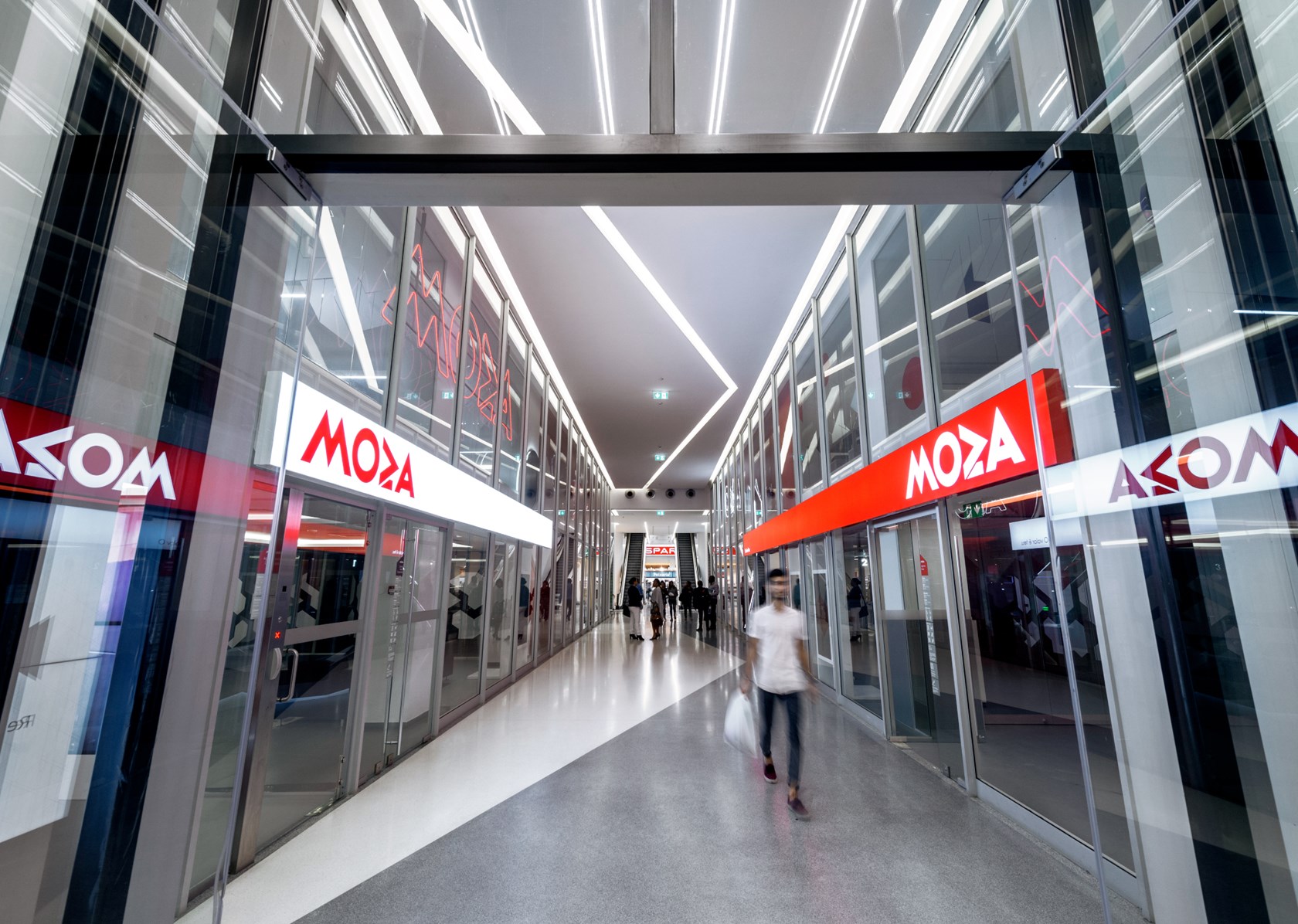
Graphically, a new typeface was adopted, more integrated with the Moza logo, reinforcing its personality and improving readability.
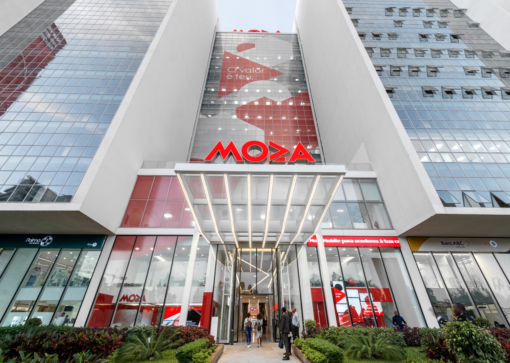
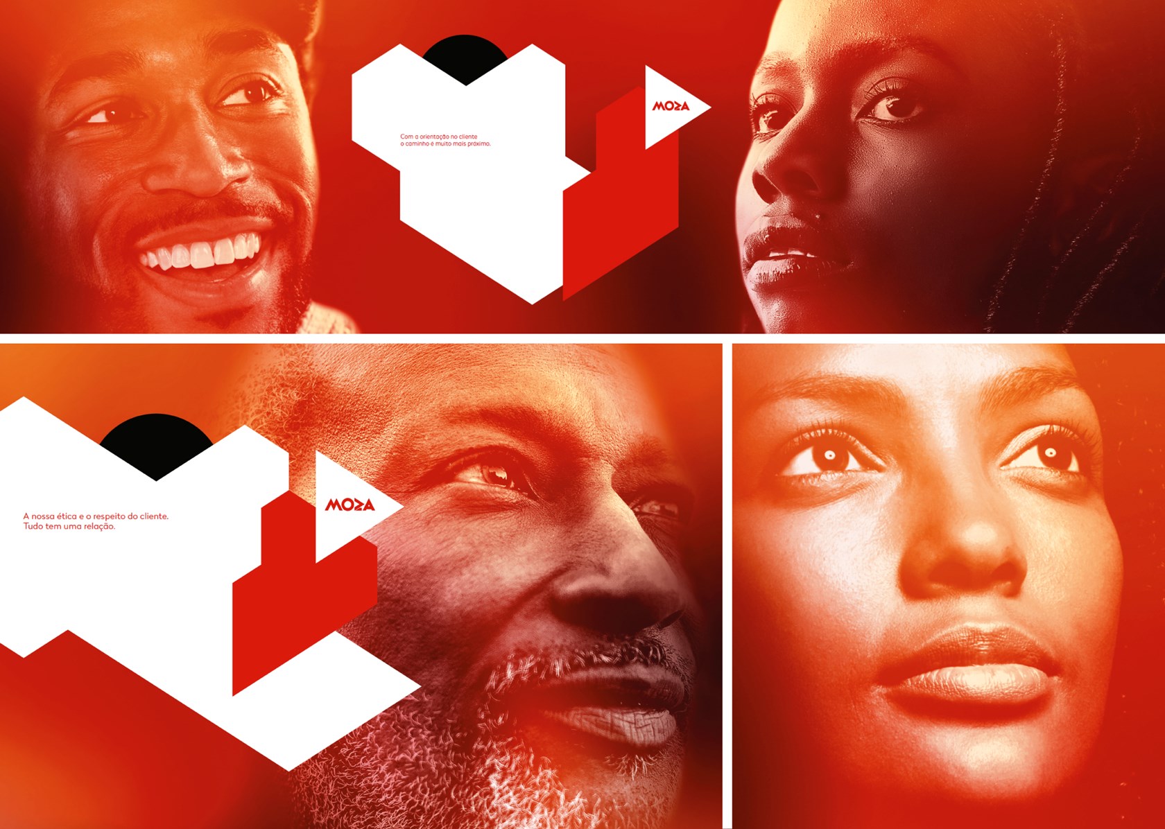
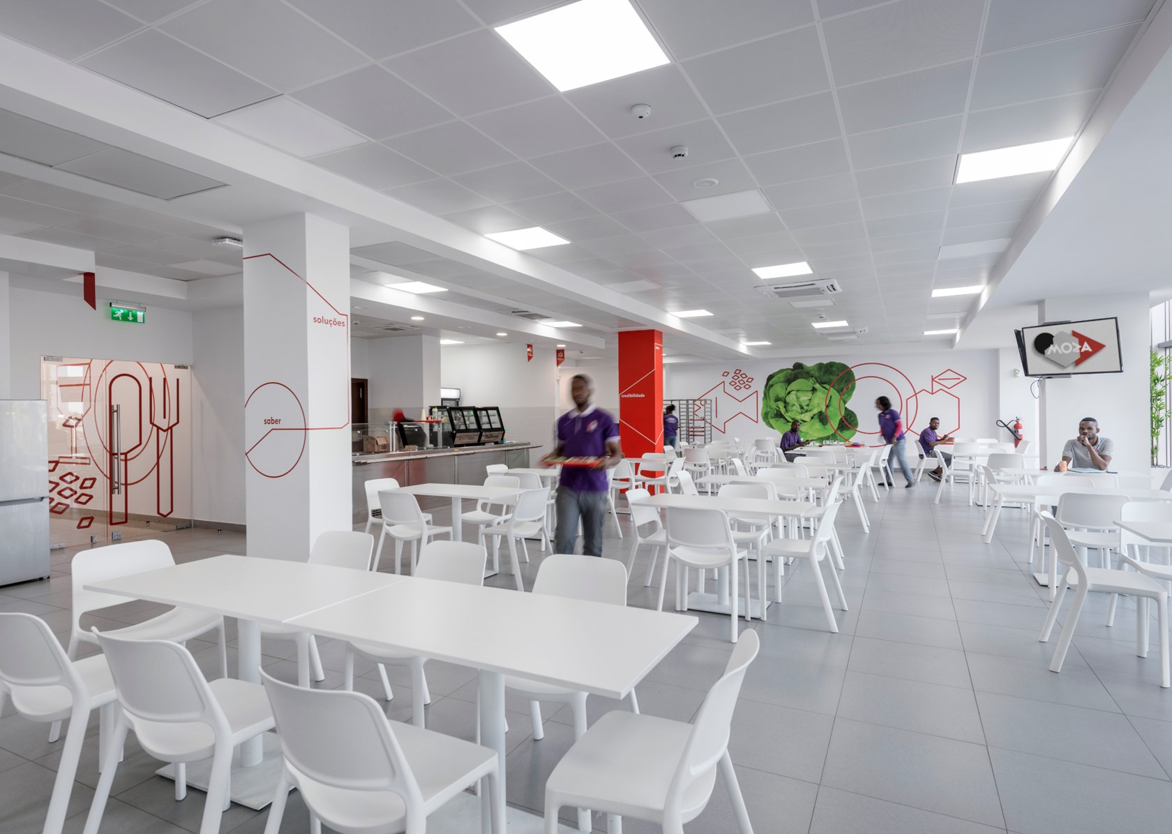
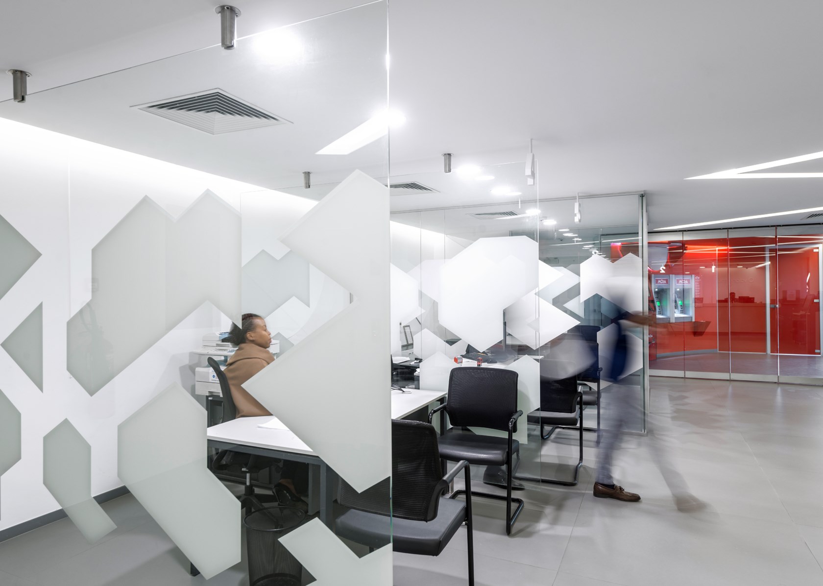
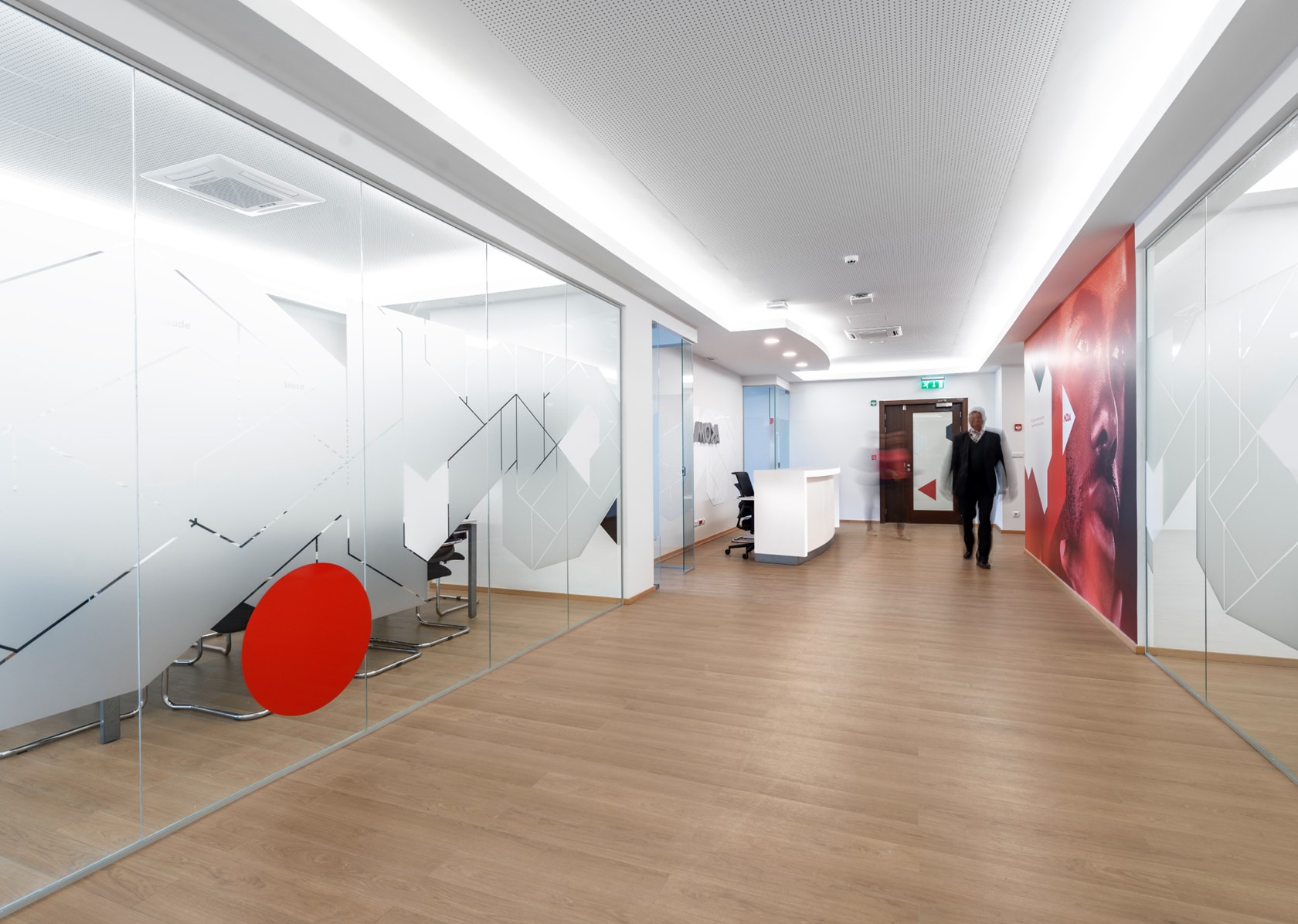
A system of geometric elements (inspired by the brand identity) was designed. Representing concepts such as movement, rigor, diversity, and relation. Applied on the façade (70x12 meters) and inside its 11 floors.
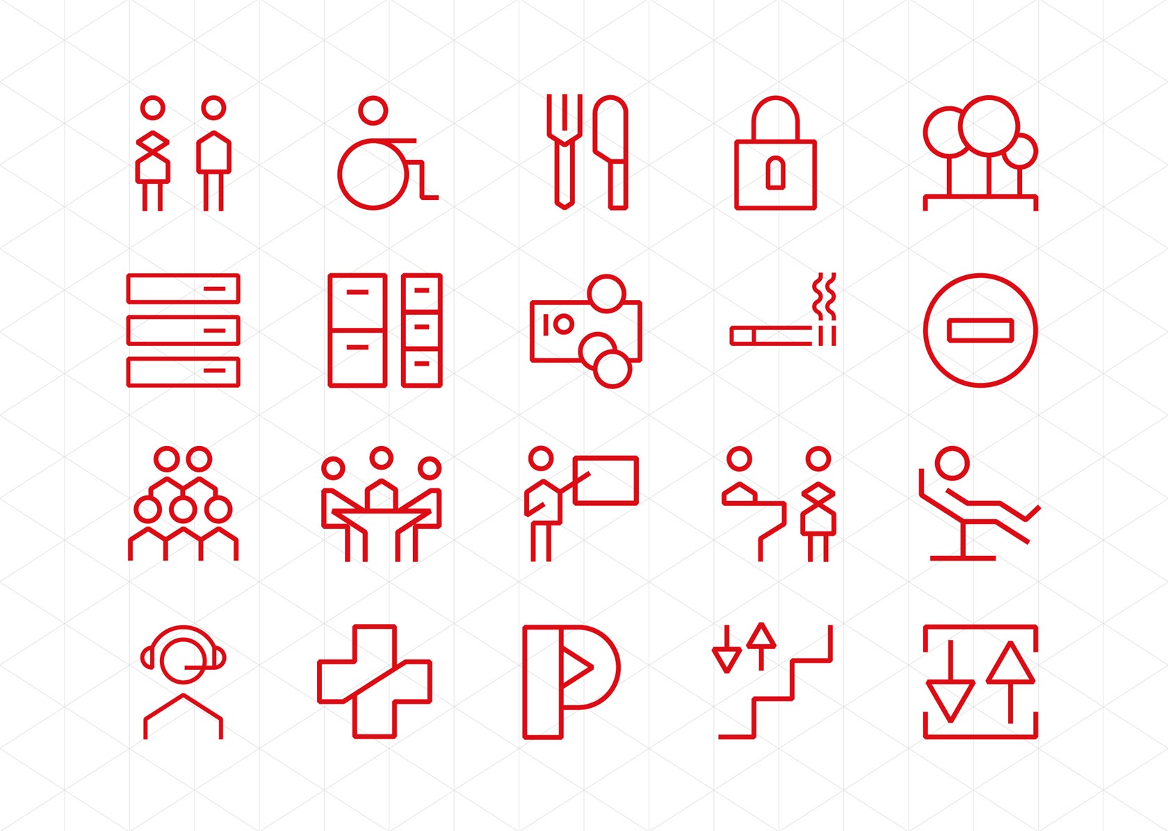
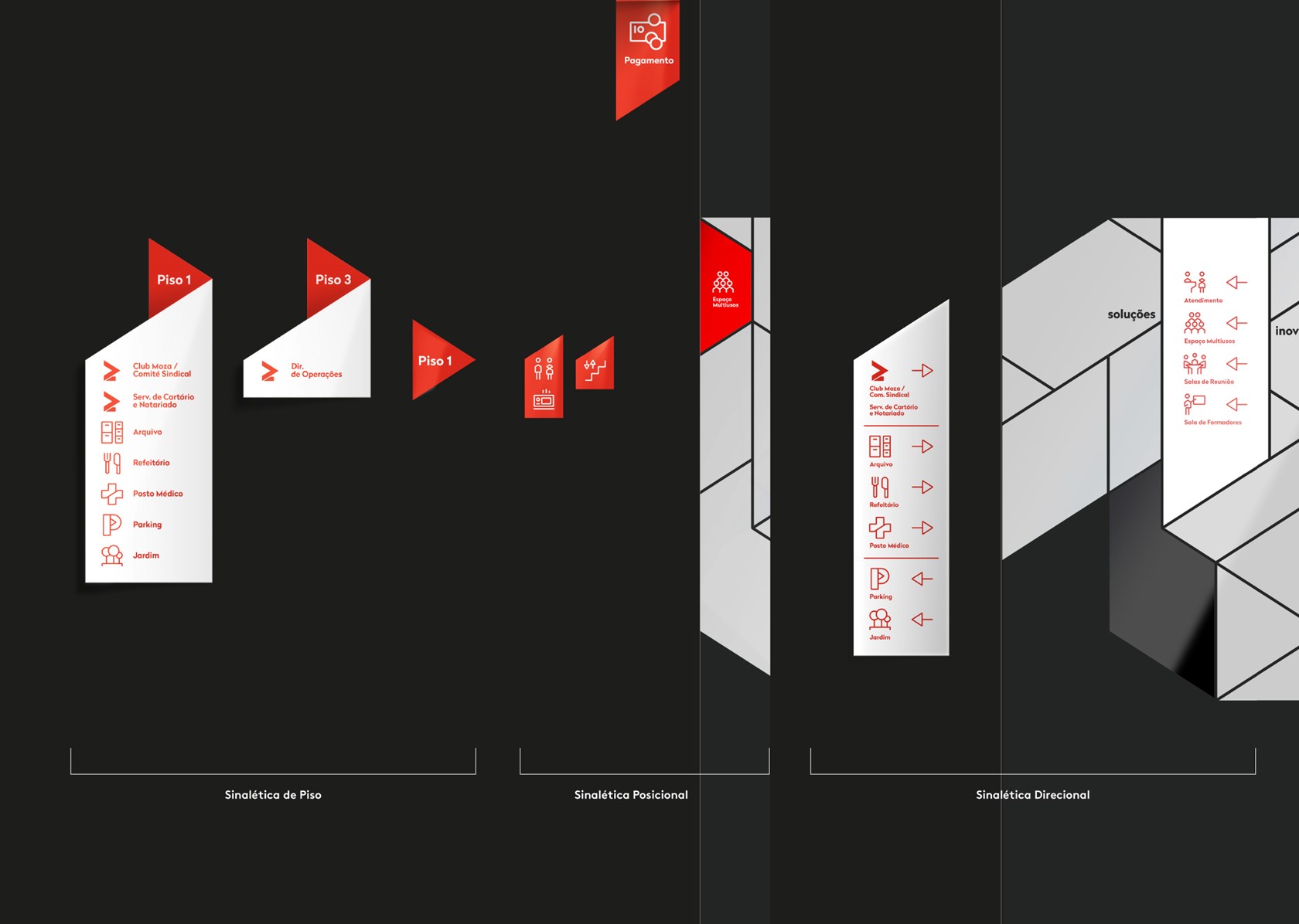
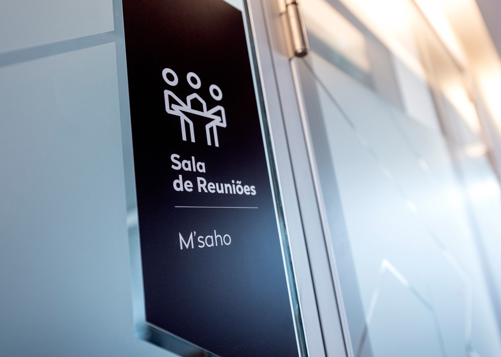
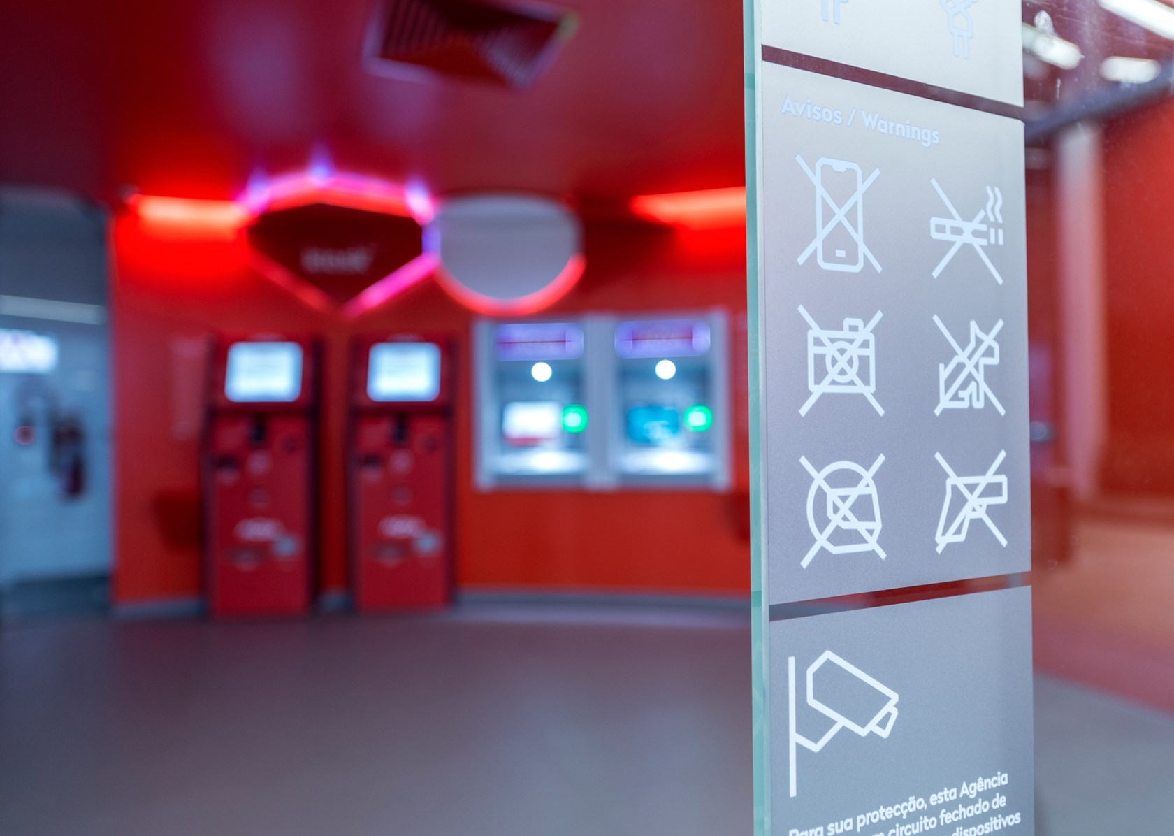
A signage system was also created, which implied the design of iconography/pictograms and the corresponding supports.
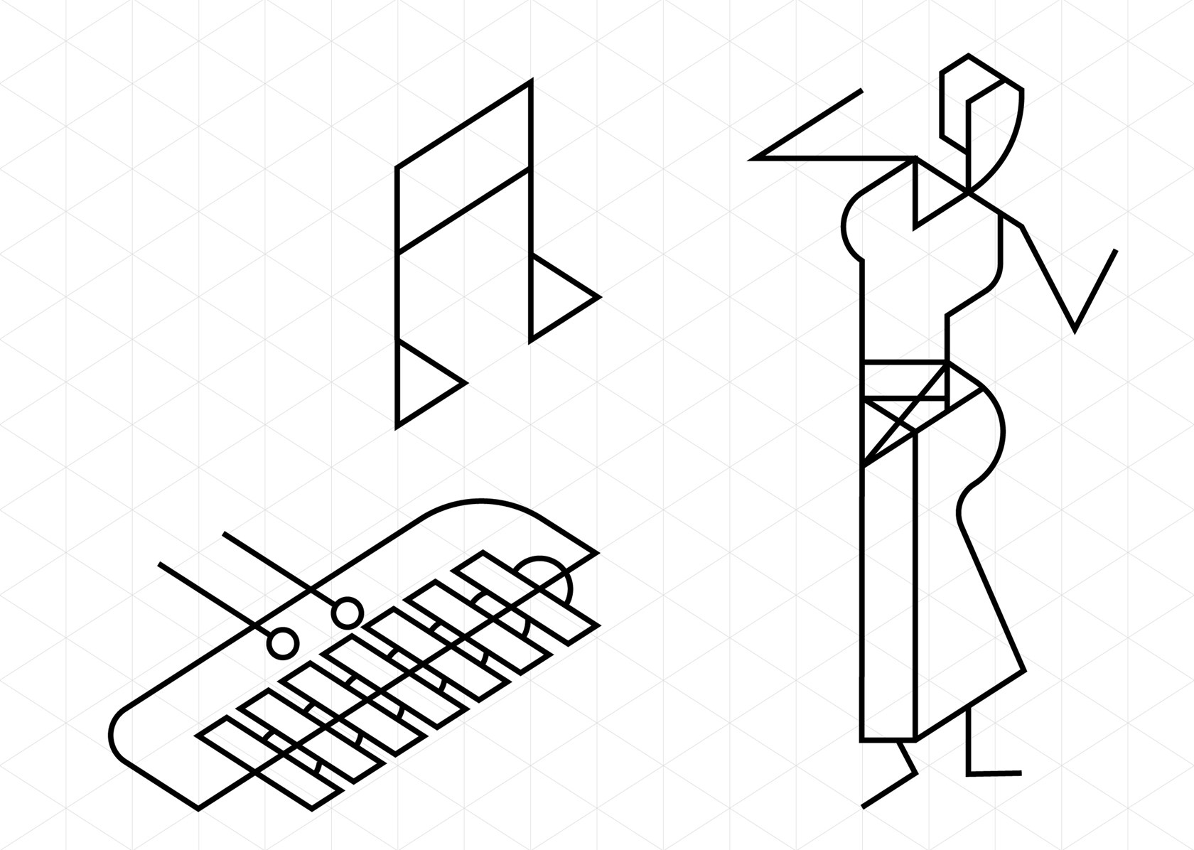
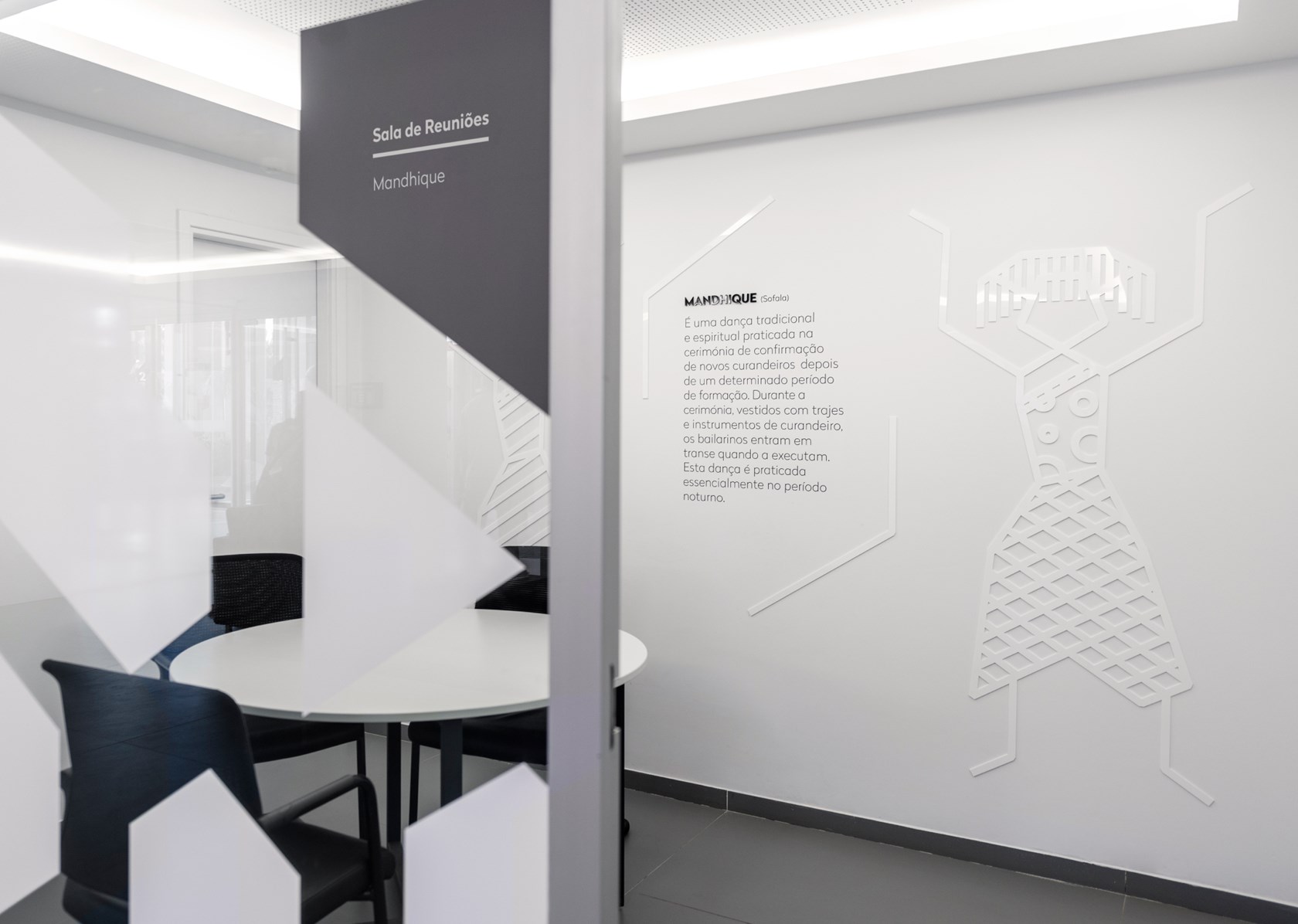
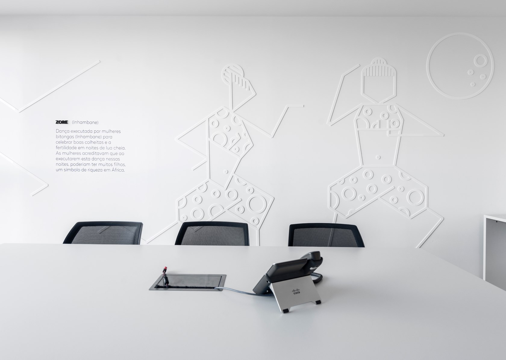
In order to show that Moza Bank had a deep relationship with Mozambique’s population (the majority of shares of national capital and branches in all provinces and major cities), panels have been developed alluding to a central theme in the country's culture - the national traditional dances.


