S—HARE
UNLKBRANDS UNLKBRANDS UNLKBRANDS UNLKBRANDS
Real Estate

Port Hillside — Branding with a view

This is a pro—ject about
  • — Market and Consumer Analysis
  • — Strategic Recommendations
  • — Corporate Identity
  • — Brand Design
  • — Brand Content
  • — Naming and Brand Voice
  • — Brand Communication
  • — Digital Communication
  • — Web Design
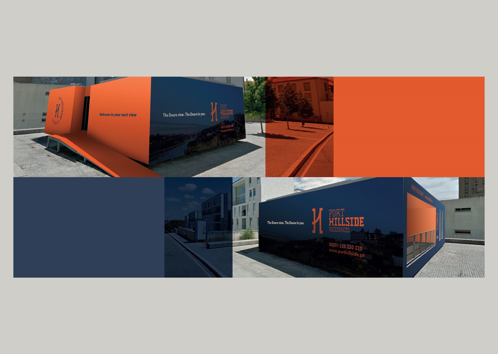
  • — Space Branding
Context

A premium location for a premium project

In the second half of the eighteenth century, many Port Wine companies settled on the left margin of the Douro River, in the city of Gaia, building large cellars. Nowadays, the area is known as the "shell of Port Wine", a commercial and cultural amphitheater and also a residential area of old farms, coveted by its location and accessibility.

The real estate project for Quinta das Palhacinhas took advantage of this privileged hillside, overlooking the Douro River. Ready to stand out in the demanding luxury condominium market.

Challenge

Branding and setting the tone for communication

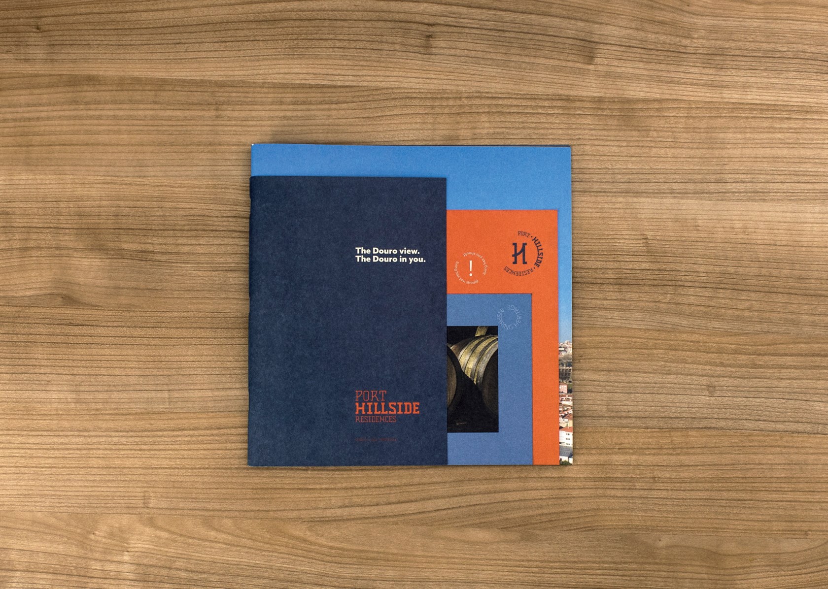
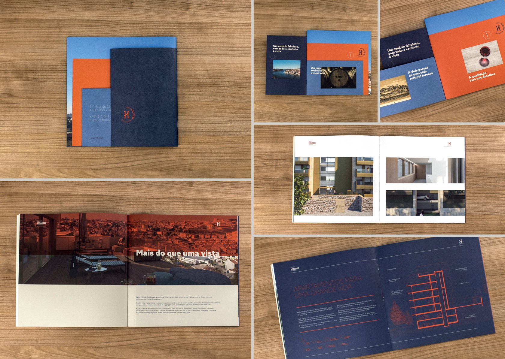
Grupo JAT asked us to create a brand identity, encompassing naming and logotype, to reflect the primeness of this new condominium in Gaia. A brand that would represent the essence of the place and also express the high standards of the project as demanded by the target audience.

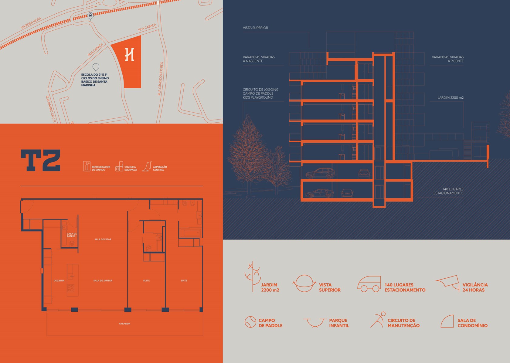
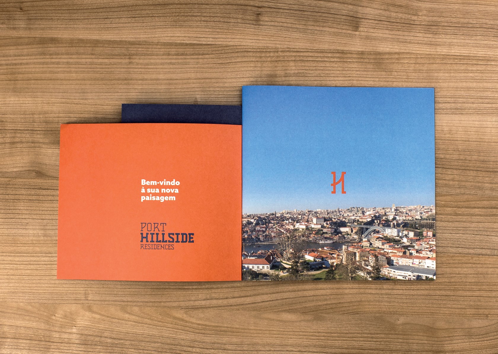
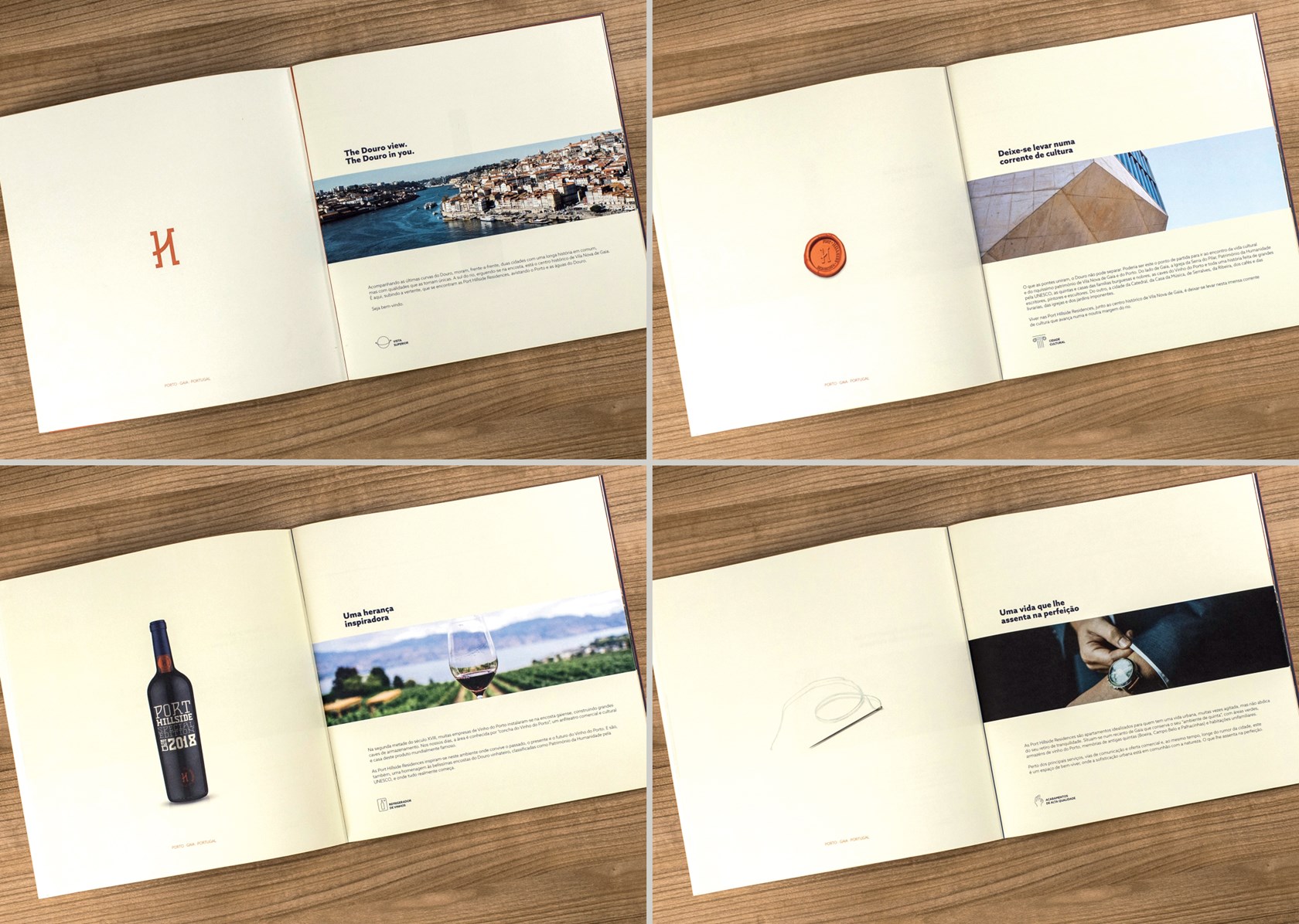
The sales stand, the web page, and the communication tools for promoting/selling of the apartments were also part of this comprehensive endeavor.

There are branding projects that challenge us to find the perfect balance between cultural heritage and contemporary discourse. This is a good example.

Miguel Viana, Creative Director at Unlock Brands
Solution

Wine legacy and location

The first step was the creation of the name for the apartment complex.
The site topography and occupancy, which allowed the residents to enjoy open space and wide views of the Douro River and the Porto city, on the one hand, and the cultural heritage of the neighboring cellars, on the other, were major inspirations.

"Hillside" suggests this elevated position (a calm and exclusive point) but close to the city. "Port" makes the connection with the history and prestige of Port wine.

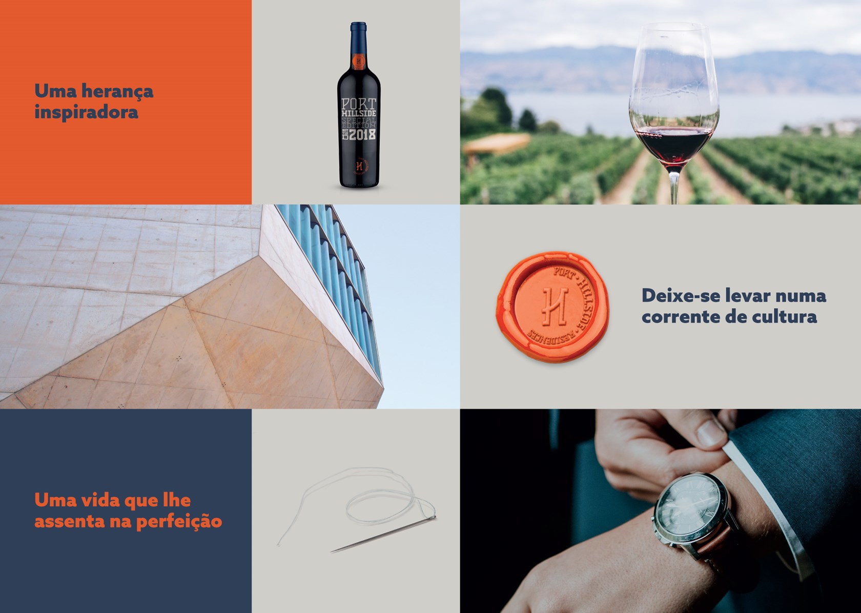
Identity and brand voice were directly influenced by Port wines‘ visual and verbal codes.

Elegance-made identity

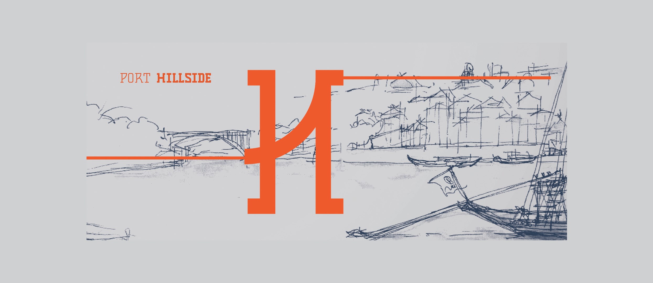
The visual identity is constructed from a fluid union of the initials "P" and "H" as if connected by a bridge between two slopes. The result is an elegant and sober monogram that refers to the symbolism of the Port “Quintas” and cellars, as well as the exquisite location near the Douro river.

The metaphors suggested by this universe and the associated symbols allowed to create a blend of brand graphic solutions, written content, and proprietary communication.

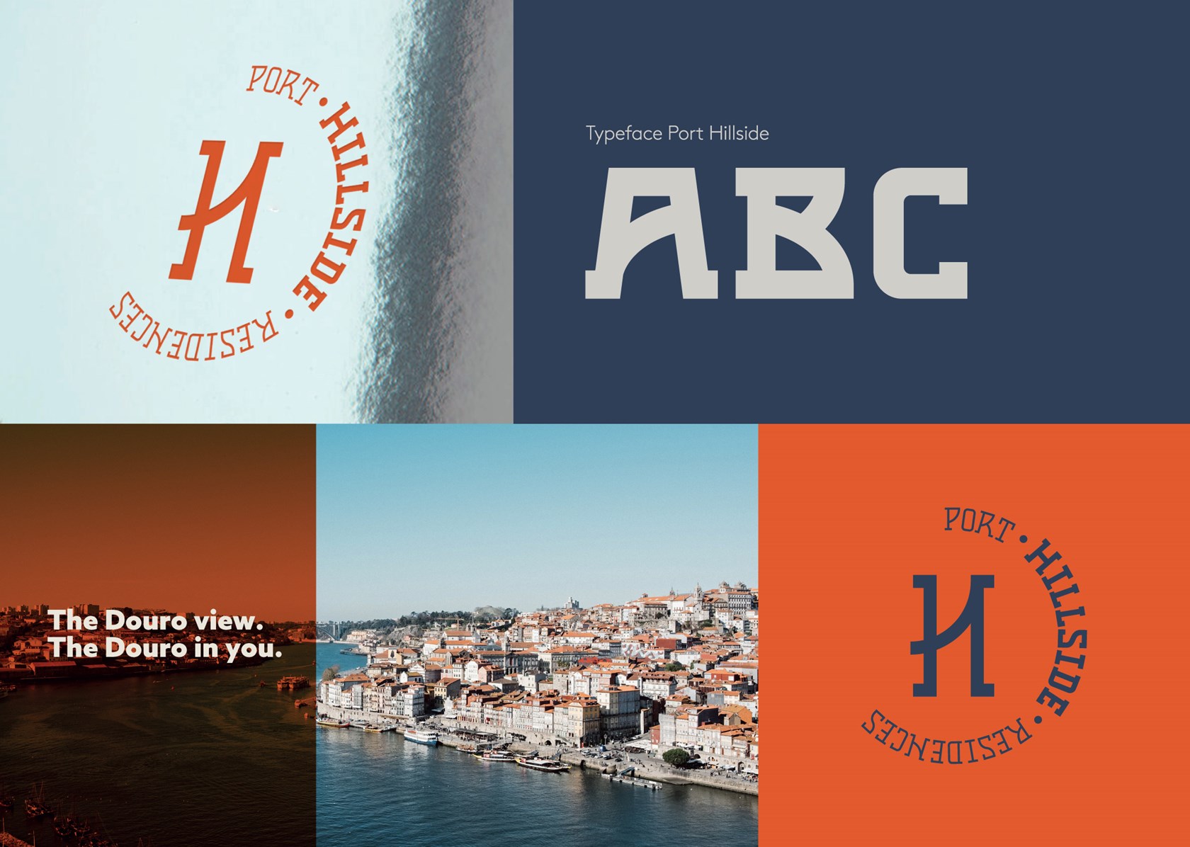
The Douro view. The Douro in you.

This was the brand tagline developed to help to position the apartments complex for their main attribute - the view over the Douro river and the unique state of mind it provided.

It was a privilege to work with the Un-lock team again, creating a brand for a quiet, elegant, comfortable, and welcoming lifestyle concept, in an old wine production farm on the hillside of the Douro River with a fantastic view about the inspiring city of Porto. The harmony between the secular city environment, the identity, and customs very typical of Port Wine and Portugal's Northern Region and the uniqueness of the project were perceived in a unique way by Un-lock and thus the Porthillside Residence was born.

Miguel Chaves, Grupo JAT

SHARE THIS WITH THE WORLD:

Next Corporate and Industry

HARV 81 Group — Branding the partners of the most demanding winemakers