The European governing body for aquatic sports affiliated with World Aquatics changed its name from LEN (Ligue Européenne de Natation) to European Aquatics, following FINA’s renaming and rebranding to World Aquatics.
The renaming led to a rebranding process with the following goals:
. highlight European Aquatics two main roles: as the global governing body in competitive aquatic sports and as a leader in learn-to-swim programs;
. communicate the organisation’s increasing relevance and impact, and aquatics as a sport and a recreational activity that all members of society should have access to, regardless of their age, gender, disability, or ethnicity;
. project the vision that drives European Aquatics forward: a new cycle of affirmation of the different levels of competition and the organisation’s increasingly wider role in society, namely through corporate social responsibility.
The challenge was to create a clear and coherent brand architecture to empower the presence of European Aquatics in all events, both self-organized and co-organized.
Also, to guarantee the unity of the different disciplines and activities and the consistency throughout the multiple tiers of the organisation (corporate, CSR, products, communication, activation, social media, etc...), while respecting their specificity.
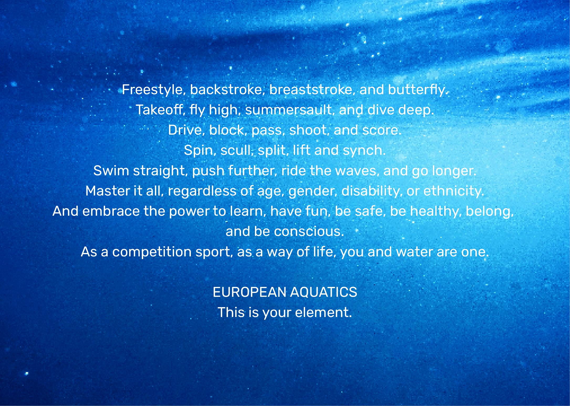
It was mandatory to define a brand voice and tagline to enhance the idea that water is the element for everyone who embraces aquatics as a competition (performance) and as a way of life (social responsibility), the 2 pillars of European Aquatics.
There were additional goals, such as to empower professionalism and bring the organisation up-to-date, to increase reputation and brand equity, and to build strong foundations to create a global love brand.
The challenge was not to design a logo but to define the foundations of a brand.
Where before there was a logo for each competition/event, now there’s a clear and coherent brand architecture that unites disciplines, events and activities, and guarantees consistency throughout the multiple tiers of the organisation.
Following an intensive and enlightening interaction process of workshops, meetings, and interviews with European Aquatics top management organisation tiers, the inspiration that guided European Aquatics rebranding came afloat: merging the two pillars of performance (competition) and way of life (social responsibility), with water at the core.
The outcome was the creation of an overall Flowing Evolution feeling, to inspire the success of European Aquatics’ long-lasting journey:
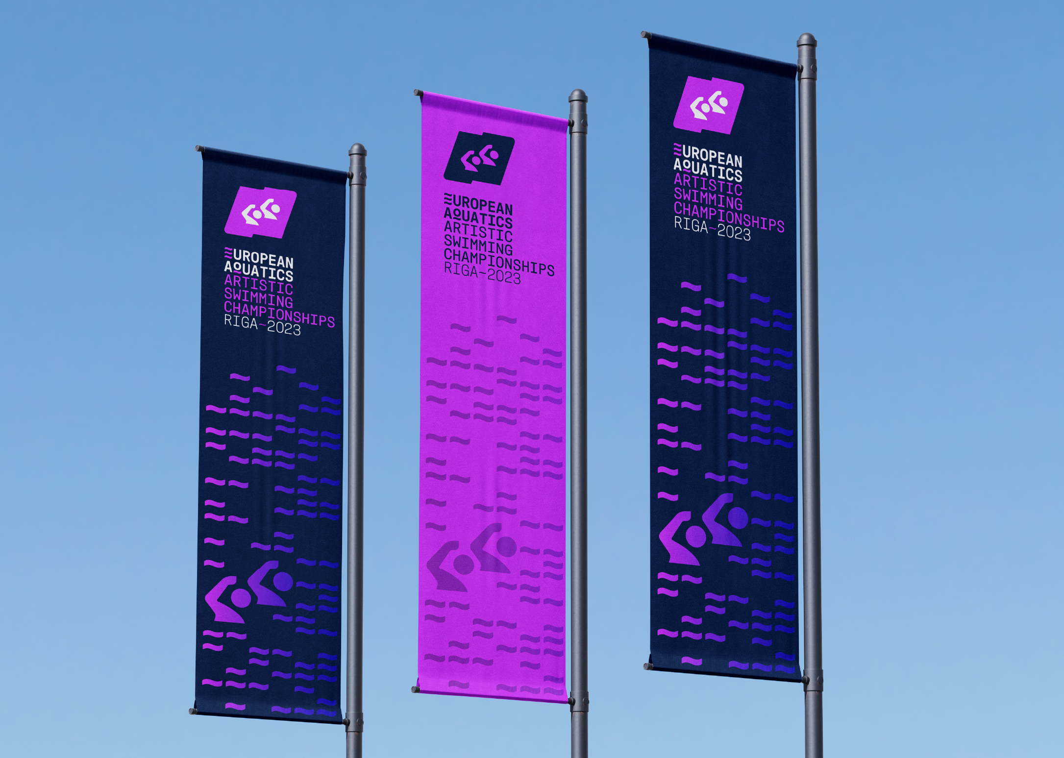
. An iconic, unique, timeless, and immediately recognized European Aquatics brand: the flowing E composed of 3 waves.
. A family of pictograms for European Aquatics disciplines, guaranteeing individual personality and cohesion as a whole.
. A coherent and comprehensive brand architecture, from the Competitions (self and co-organized) to the Awards and European Aquatics TV, with a strong emphasis on Aquatics Social Responsibility.
. An inspiring and engaging brand voice that brings together everyone who loves to be one with water: this is your element.
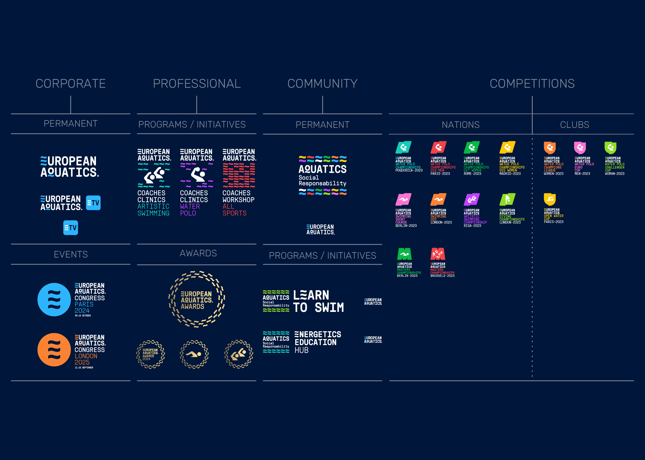
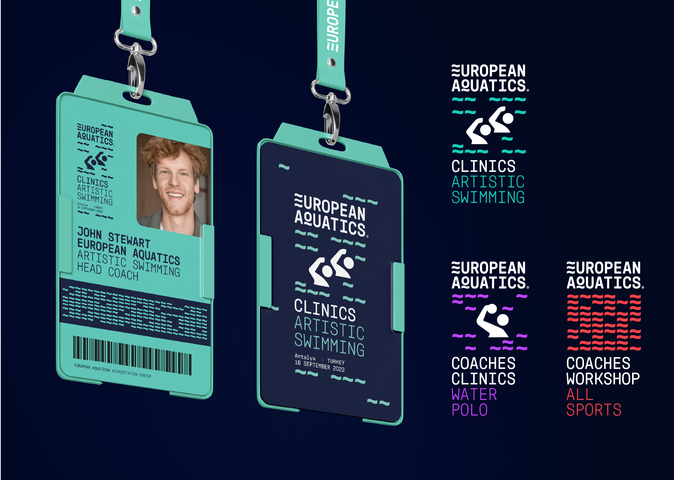
The brand architecture definition was one of the main challenges of European Aquatics rebranding, with the definition of four main areas of activity: Competitions, Community, Corporate and Professional.
The Competitions area includes all European Aquatics Nations and Clubs’ Competitions.
The new brand architecture ensures:
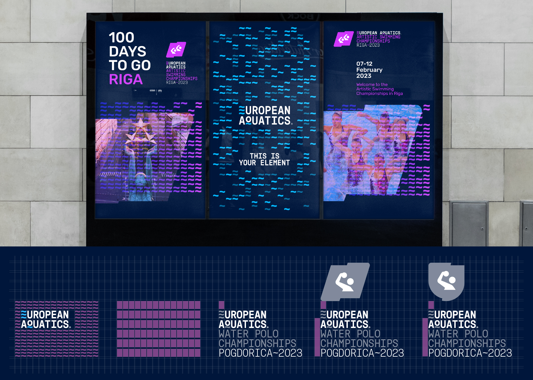
. the presence of European Aquatics in all events: organized directly by the organization or in partnership with local entities;
. a clear and coherent information hierarchy, from Club and Nations events to Multi-Discipline/Special Competitions.
. coherence and consistency across disciplines and competitions, to harmonize the relevance/importance of all disciplines, and to differentiate and identify each competition.
. a specific shape for nations (flag), clubs (badge), and Masters (M icon); within the defined shapes, the disciplines’ pictograms and the colour palette are applied; always respecting the defined colour palette, the events can assume any colour, to reinforce the organisation’s inclusivity and performance.
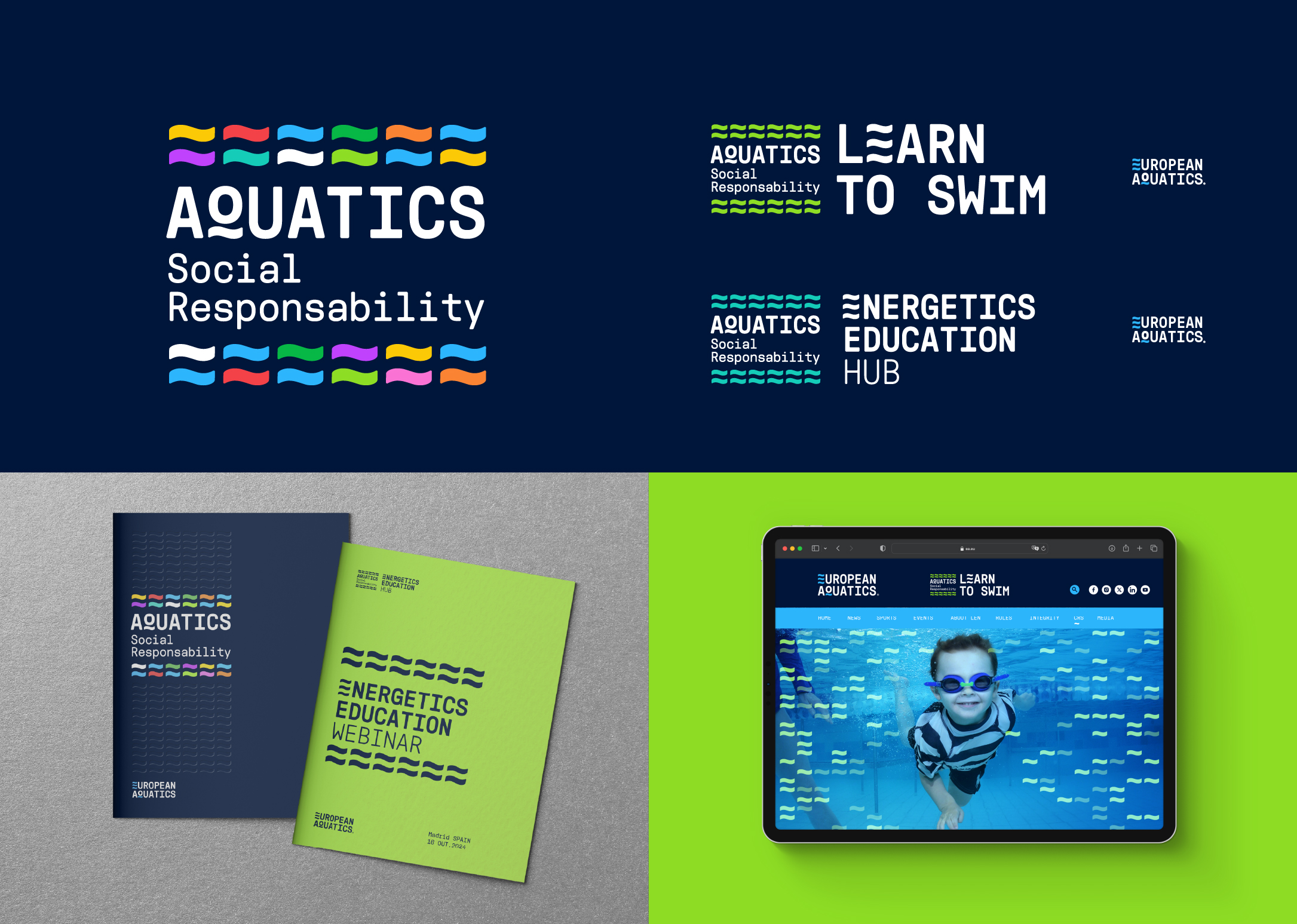
The Community area includes the permanent brand dedicated to CSR (appropriately renamed Aquatics Social Responsibility), and CSR present and future Programs/Initiatives like Learn to Swim and Energetics Education Hub.
The logo’s flowing waves spread out in multiple colours to embrace European Aquatics inclusivity, joyfulness and the concept of water as a way of life.
The Corporate area includes the permanent brand ETV and events brands such as congresses. The Professional area includes Programs/Initiatives, such as clinics and workshops, and European Aquatics Awards.
To reinforce European Aquatics energy and fluidity, the logo’s flowing waves creatively frame each event or sub-brand, enhancing the multi-layered communication power of European Aquatics.