S—HARE
UNLKBRANDS UNLKBRANDS UNLKBRANDS UNLKBRANDS
IT/Digital

Circuit Booking —
Branding the future of racing experiences

This is a pro—ject about
  • — Market and Consumer Analysis
  • — Strategic Recommendations
  • — Corporate Identity
  • — Brand Design
  • — Brand Architecture
  • — Naming and Brand Voice
  • — Brand Communication
  • — Integrated Projects
  • — Space Branding
Context

A new App. A new brand.

Before the finishing line, before the warm-up, before hearing the engines (if it’s not electric, of course), it all starts at Circuit Booking.

After 10 years of matching companies with circuits all over the world, Munich-based company Circuit Booking was now focusing on the B2C segment, with this all-new, best-in-class racing track experiences booking platform.

A new app for the next generation of circuit-based experiences.

Challenge

Starting with a pole position

The goal was clear: branding the one-stop-booking app for track days, and other exciting and safe circuit experiences.

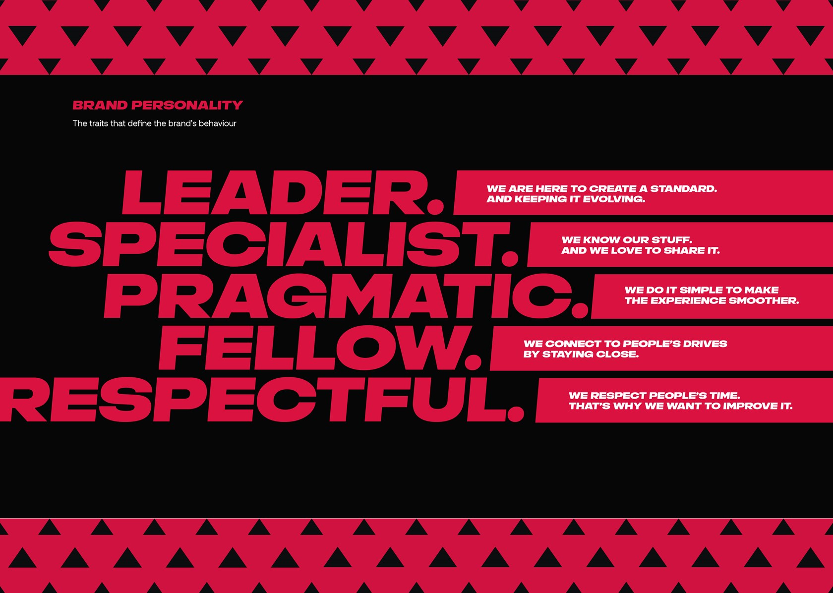
Being part of a community is quite special among motorsports fans. Circuit Booking is the ideal platform for celebrating and improving this connection. The new brand makes this ambition visible and relatable, with a powerful, one-to-one, visual approach, and a verbal tone that makes it a specialist one can always count on.

Miguel Viana, Creative Director of Unlock Brands
Solution

A brand system ready to engage

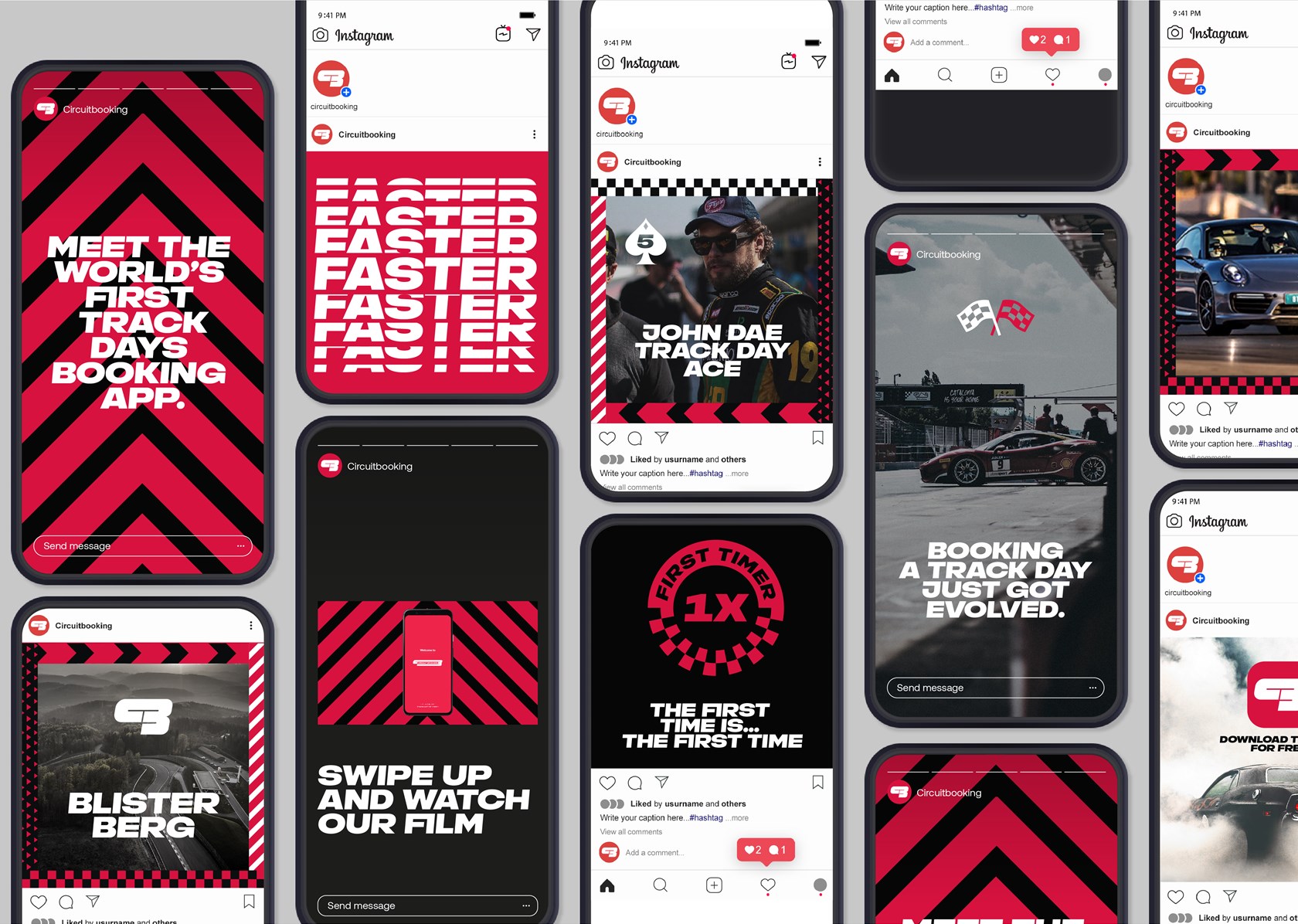
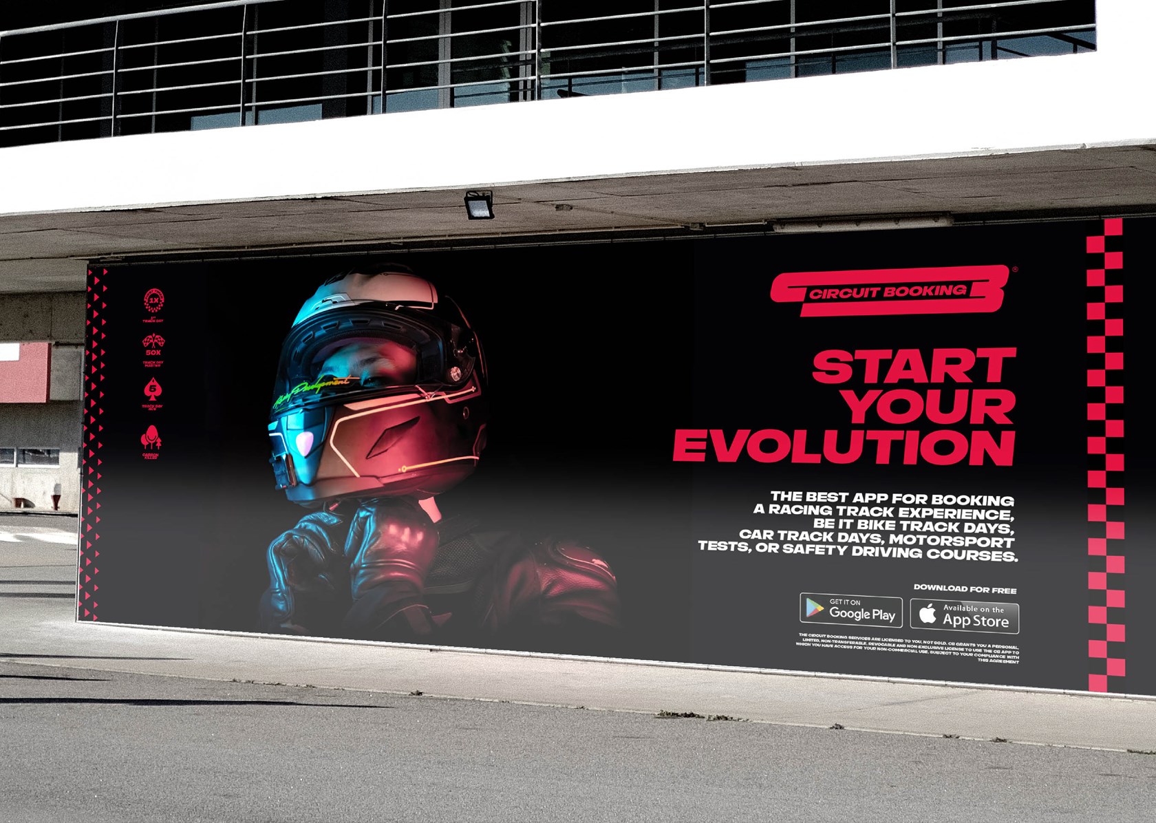
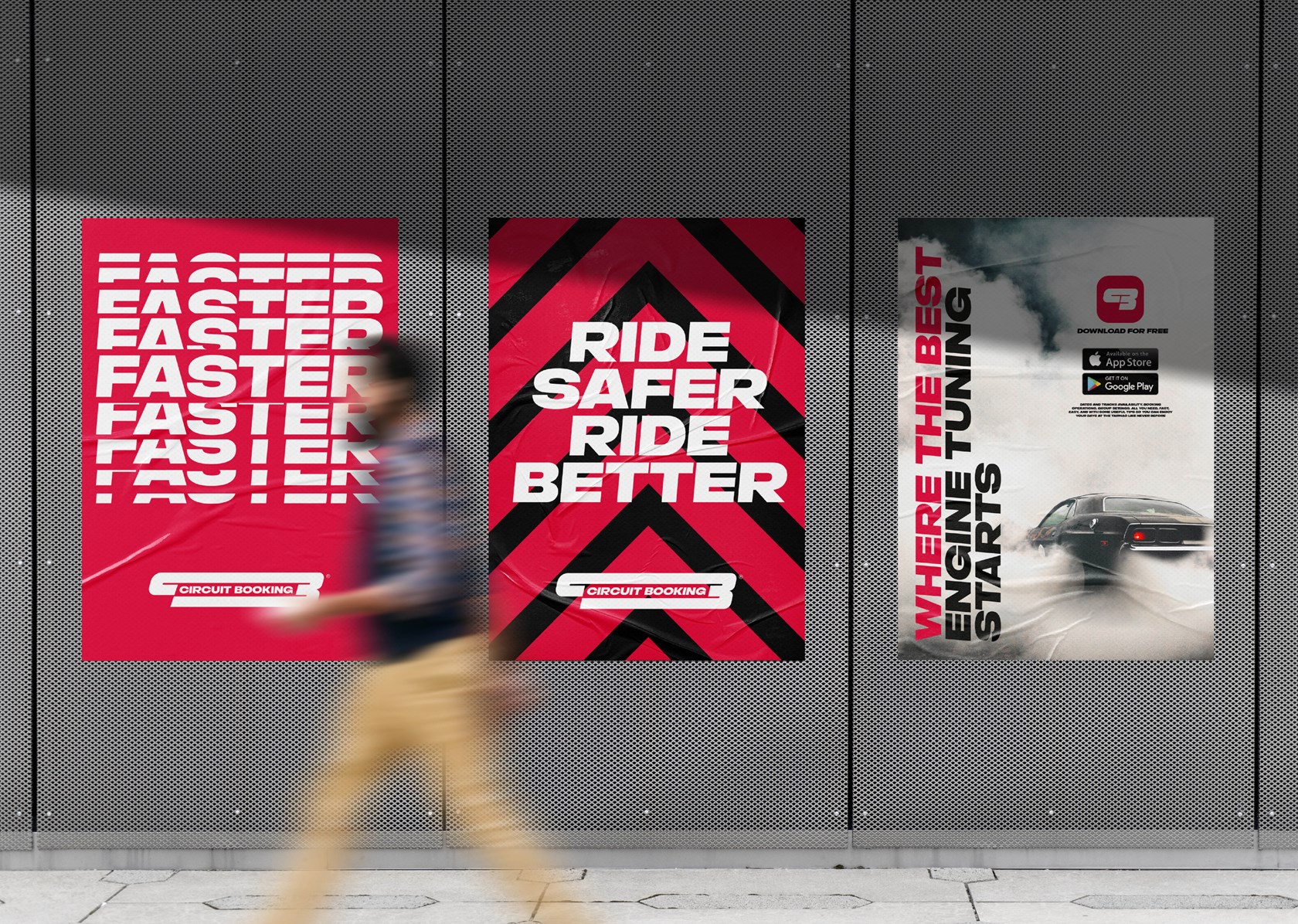
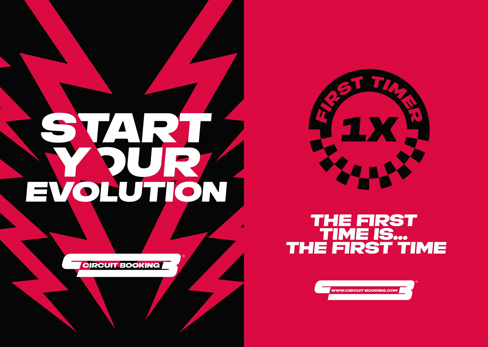
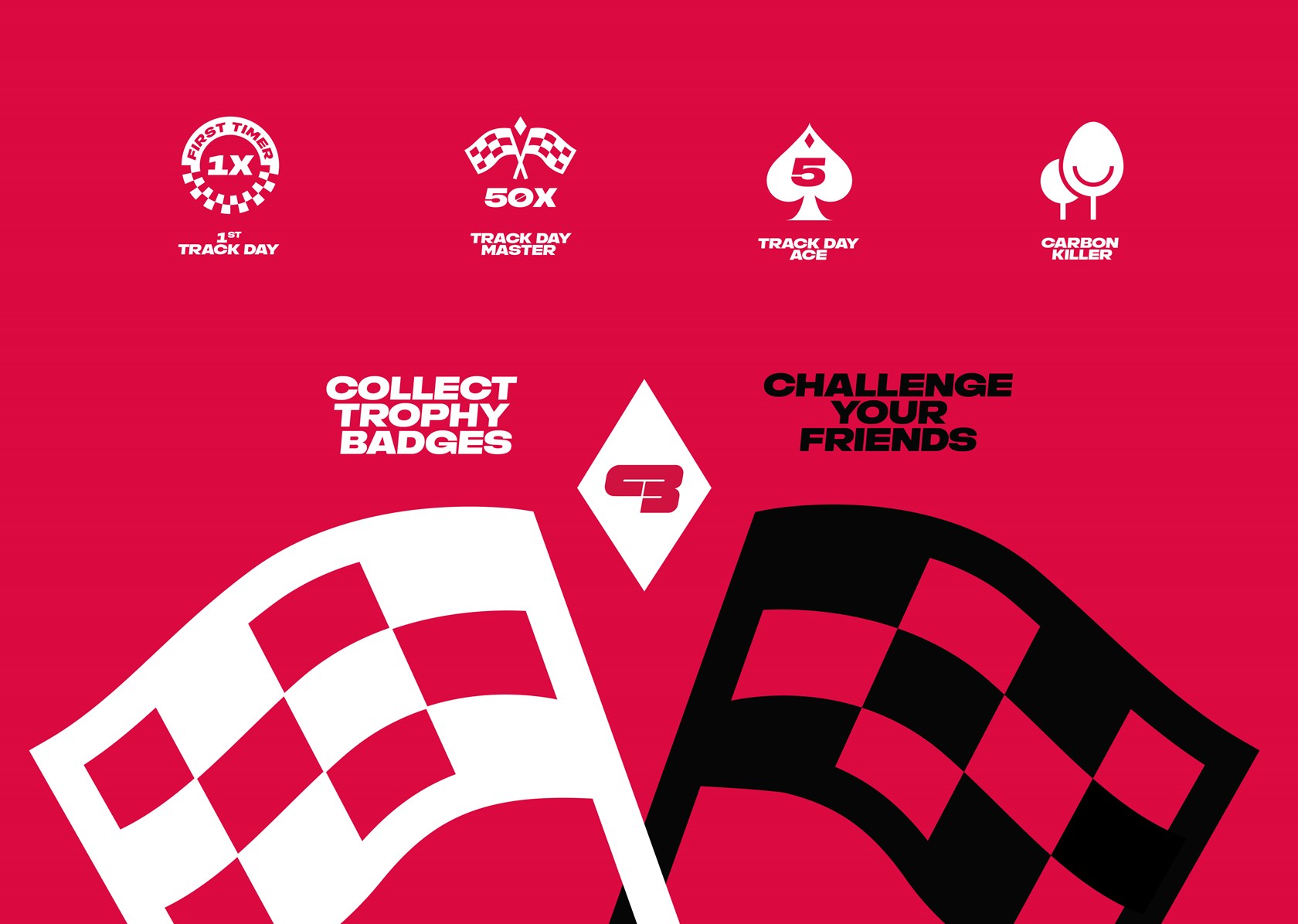
This amazing project was ignited by insightful interviews with some of the most relevant experts from motorsports, and continued its course all the way to developing a whole new brand visual and verbal system. Visual identity, graphic universe, UI design, pictograms, brand speech, social media, and communication tools were all part of the scope, which also included branding Circuit Business, the new B2B face of the company.


A powerful Logotype

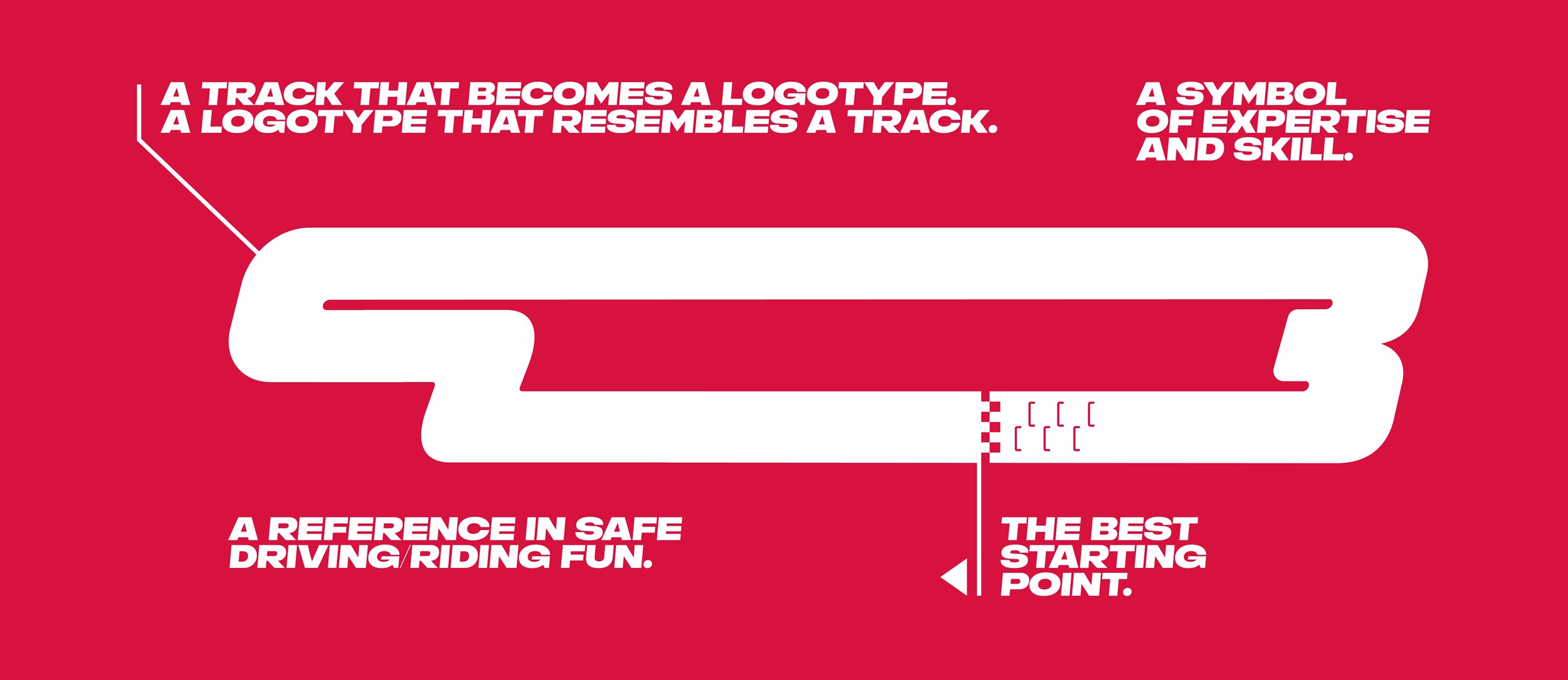
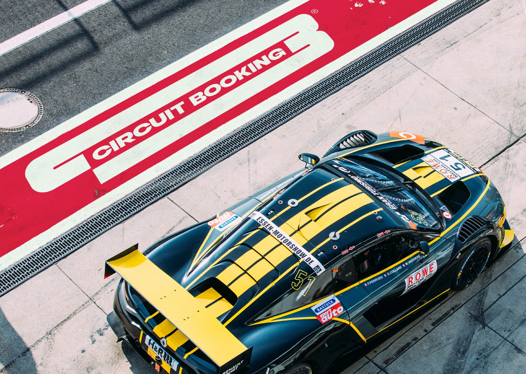
Inspired by the racing track designs, with its straights and curves, the solution portrays a C and a B that are also a circuit.

Focus on Naming

The visual solution of the logotype highlights the Circuit Booking name, while providing it with a sense of performance and identity.


Racing Colour and Typography

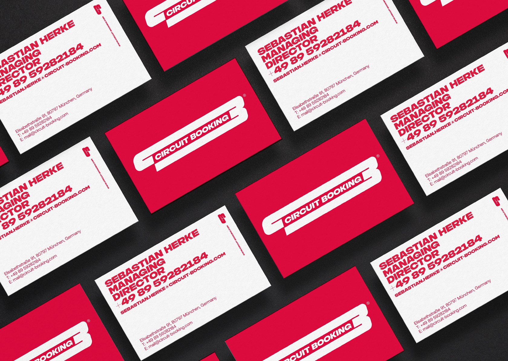
Red is the main colour of Circuit Booking, as a reference to one of the most iconic colours in motorsports. The typography underlines this inspiration, with bold, tilted characters.

Our client, Sebastian Herke, was a true engine to this project. His expertise and ambition of always wanting to be 1,5 seconds ahead of the competition helped to define the high standards of the brand.

José Cerqueira, Head of Strategy and Content

SHARE THIS ONE WITH THE WORLD:

Next Sustainability

EXPO 2023 Doha Qatar —
A brand for a greener future