S—HARE
UNLKBRANDS UNLKBRANDS UNLKBRANDS UNLKBRANDS
IT/Digital

Catappult — Branding a breakthrough in the world of Apps

This is a pro—ject about
  • — Market and Consumer Analysis
  • — Strategic Recommendations
  • — Corporate Identity
  • — Brand Design
  • — Naming and Brand Voice
  • — Digital Experience
Context

A market dominated by two giants.

When the regular user installs an app on her/his device, odds are that these are being downloaded from app stores either from Google or Apple. In 2019, there were about 2.6 million apps for Android and 2.2 million apps for iOS. But the five billion mobile users in the world have more options in hand when it comes to choosing the provider of the apps they want to install. Like Aptoide, an Android app store that has been growing its user base for the last years, gathering over 250 million users worldwide.

Challenge

A brand to stand up for app developers

App stores are often the shopping window for apps, playing the role of distributors. As such, they charge a percentage to the app developer based on the related app purchases.

Aptoide wanted to change the rules of the game by launching a revolutionary new tool for developers: a platform where the developers could distribute their apps across multiple app stores, while increasing their revenue, compared to the established deals. A completely new way of app monetization.


Such a change needed a brand. A naming and a visual identity to mobilize and engage developers from around the world in this new movement.

The Catappult brand was created to express the movement it represents. A new player in the app development industry, changing the game for the better. This sense of evolution, of change, is portrayed in the branding solution.

Miguel Viana, Creative Director of Unlock Brands
Solution

Unleashed by the new naming

Catappult. A simple metaphor for the idea of launching something, of releasing it and seeing it fly. Because that was just what the platform would provide: an unseen reach for the developers’ apps, free from boundaries and endless operational processes. Thus the new brand tagline - unleash your reach.

And yes, we have “app” within the word Catappult. It is not a typo.

A logo that adds value, not redundance

The solution for Catappult‘s logotype was driven by the principle of not showing a catapult. The name already stated the obvious, so the logo could bring more to the brand. It was the movement, the motion of something that is being thrust through the air that inspired the solution, a gradient-based custom typeface.

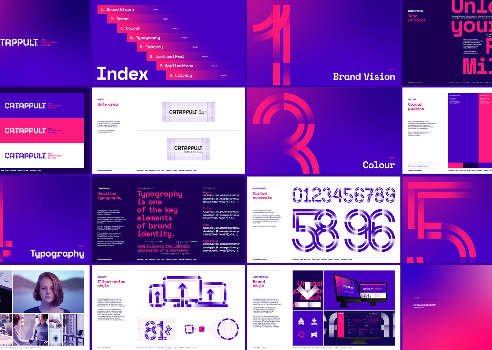
A comprehensive visual identity

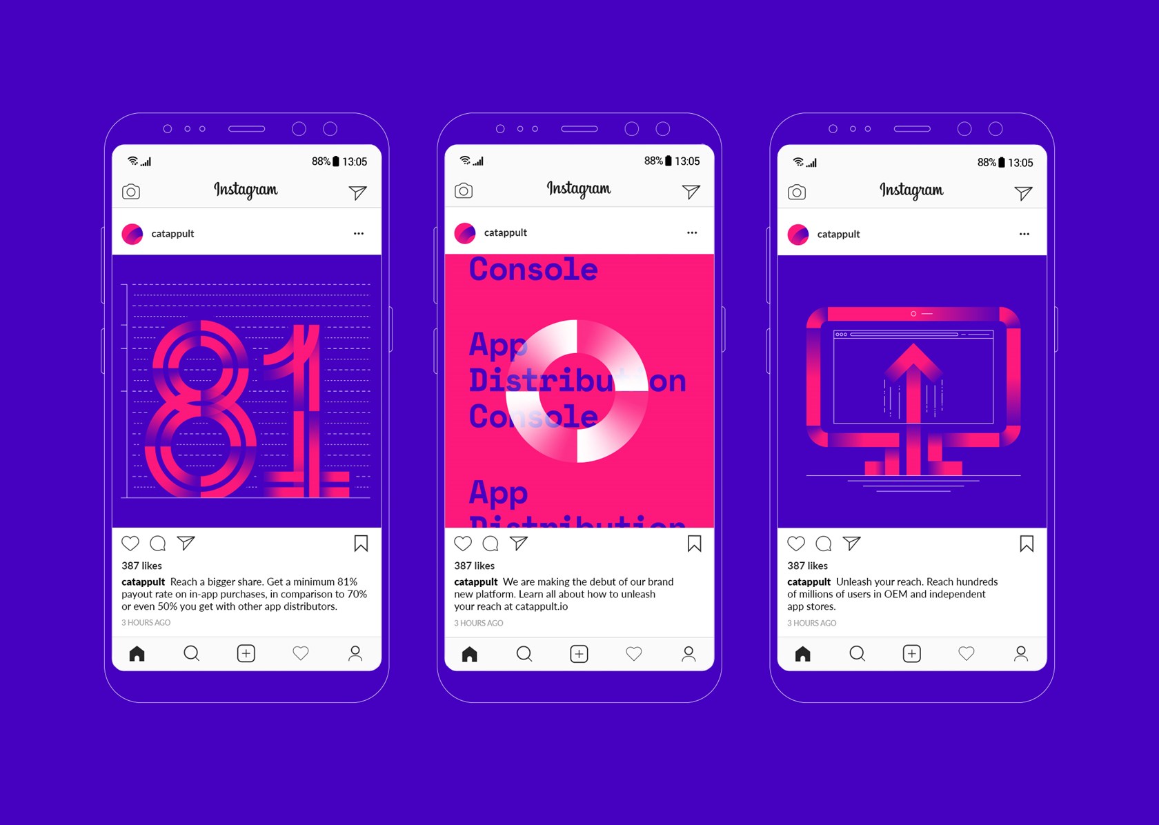
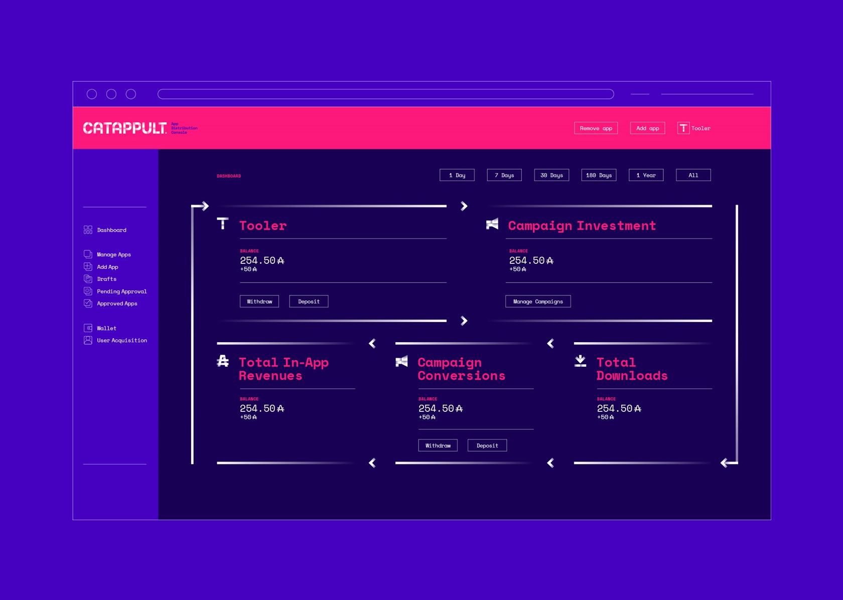
The branding development included the visual universe that would support all brand communication needs, from back-office interfaces to high visibility in international fairs.


The gradient effect and the colour scheme served as the pillars of this system, allowing the creation of custom illustrations and graphic compositions.

Results

Since its launch, Catappult has been a success story, helping several developers to attain their goals, be it more downloads or increased revenue in each in-app purchase.
The revolution of app monetization is on its way. Catappulted by a singular and vibrant brand.

SHARE THIS WITH THE WORLD:

Next Mobility/Transportation

Atlantic Corridor — A brand on track